# Logistic Regression: Modelling a Yes/No Outcome
## Welcome back {.unnumbered}
Every model so far has predicted a **quantity** — a sales figure, an
average, a rate. Today the outcome changes shape: it becomes a
**yes or no**.
That's a bigger share of People Analytics than the continuous case.
Did they accept the offer? Did they pass probation? Were they
promoted? Did they leave? Each is a coin that landed one way or the
other, and each needs a model that respects the fact.
### Back to the question we started with {.unnumbered}
Chapter 1 opened on *what predicts who gets promoted?* and we've been
circling it ever since. Your VP of Sales has the pieces now — the
promotion rate (Chapter 4), what a customer-rating point is worth
(Chapter 6), whether the performance ratings track anything real
(Chapter 7) — and she wants them assembled into one answer:
> **Given what we know about a salesperson, how likely are they to be
> promoted — and which factors actually move that number?**
The outcome `promoted` is **0 or 1**. Everything else you know still
applies: same `brm()`, same priors, same posteriors, same credible
intervals. Only the family changes, and one new idea comes with it.
::: callout-note
This is the last new model family in Part III. Chapter 10 then takes
everything from Chapter 1 to here and turns it into a repeatable
workflow you can apply to your own questions.
:::
## What you'll be able to do by the end {.unnumbered}
1. Explain why a straight line can't model a yes/no outcome, and what
**log-odds** do about it
2. Fit a **logistic regression** in `brms`
3. Interpret coefficients as **odds ratios** — and avoid the mistake
almost everyone makes with them
4. Report results as **predicted probabilities** a stakeholder can act
on
5. Match a **posterior predictive check** to a binary outcome
------------------------------------------------------------------------
## Setup
```{r setup}
library(tidyverse)
library(peopleanalyticsdata)
library(brms)
library(tidybayes)
library(ggdist)
theme_set(theme_minimal(base_size = 13))
set.seed(2026)
data("salespeople", package = "peopleanalyticsdata")
# Chapter 1 found a single missing value in each of `sales`,
# `customer_rate` and `performance`; dropping those rows here keeps
# the rest of this chapter's code simple.
salespeople <- salespeople |>
drop_na(sales, customer_rate, performance, promoted) |>
mutate(
customer_rate_s = as.numeric(scale(customer_rate)), # <1>
performance_f = factor(performance) # <2>
)
```
1. `scale()` **standardises**: it subtracts the mean and divides by the
standard deviation, so `customer_rate_s` is measured in standard
deviations away from average rather than in rating points. Chapter 6
only centred; the reason for the extra step is in the box below the
model.
2. Four labels, not a number, exactly as in Chapter 7.
------------------------------------------------------------------------
## Back to our opening question
*What predicts who gets promoted?* We asked this in Chapter 1 and have
been building toward it ever since.
The outcome `promoted` is **0 or 1** — and that needs a different kind
of model.
### Why a straight line fails
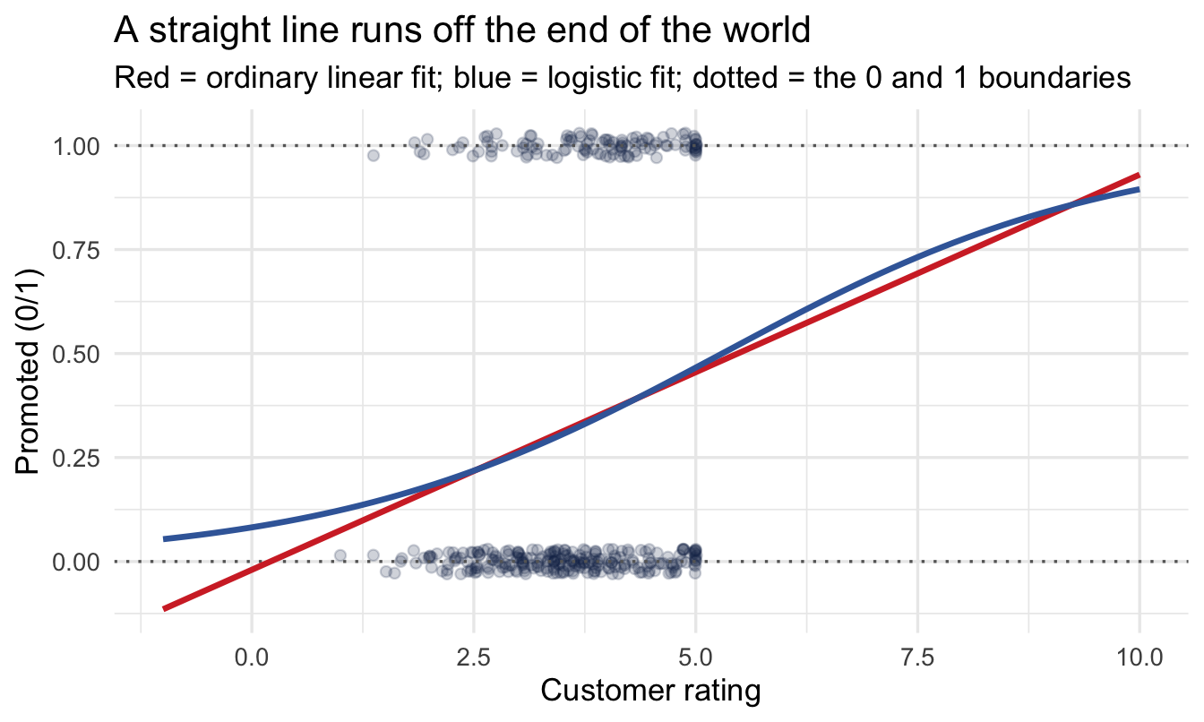
If we fit an ordinary regression to a 0/1 outcome, the line keeps
going — because that's what lines do.
```{r why-not-linear}
#| code-fold: true
#| code-summary: "Show the plotting code"
ggplot(salespeople, aes(customer_rate, promoted)) +
  geom_jitter(height = 0.03, alpha = 0.20, colour = "#122a52") +
  geom_hline(yintercept = c(0, 1), linetype = "dotted", colour = "grey40") +
  geom_smooth(method = "lm", formula = y ~ x, se = FALSE,
              fullrange = TRUE, colour = "#d32f2f") +
  geom_smooth(method = "glm", formula = y ~ x, se = FALSE,
              method.args = list(family = binomial),
              fullrange = TRUE, colour = "#3d68a8") +
  expand_limits(x = c(-1, 10)) +
  labs(title = "A straight line runs off the end of the world",
       subtitle = "Red = ordinary linear fit; blue = logistic fit; dotted = the 0 and 1 boundaries",
       x = "Customer rating", y = "Promoted (0/1)")
```
::: callout-important
Follow the red line far enough and it predicts a **−0.3 probability**
of promotion, or a **1.4**. Both are nonsense — probabilities live
between 0 and 1.
The blue line bends. It approaches 0 and 1 without ever reaching them,
which is exactly the behaviour a probability should have. The rest of
this section is how it does that.
:::
### Odds, and then log-odds
The trick is to stop modelling the probability directly and model
something unbounded instead. It takes two steps.
**Step one: odds.** Instead of "30% chance of promotion", say the
**odds** — the chance it happens divided by the chance it doesn't:
$$\text{odds} = \frac{p}{1-p}$$
A 30% chance is odds of 0.3 / 0.7 ≈ **0.43**, or a bit under one to
two. A 50% chance is odds of exactly 1. A 90% chance is odds of 9.
That's progress: probabilities were trapped between 0 and 1, but odds
can be anything from 0 upwards. Still bounded below, though.
**Step two: take the logarithm.** Log-odds — the **logit** — run from
minus infinity to plus infinity:
$$\text{logit}(p) = \log\!\left(\frac{p}{1-p}\right)$$
| Probability | Odds | Log-odds |
|-------------|-------------|-------------|
| 0.10 | 0.11 | −2.20 |
| 0.30 | 0.43 | −0.85 |
| 0.50 | 1.00 | **0.00** |
| 0.70 | 2.33 | 0.85 |
| 0.90 | 9.00 | 2.20 |
Two things worth memorising from that table: **log-odds of 0 means a
50/50 chance**, and the scale is **symmetric** — 0.3 and 0.7 sit the
same distance either side of zero.
Now a straight line is safe. We fit the line on the log-odds scale,
where it can run off in either direction without embarrassment, then
translate back to a probability at the end. That translation is what
bends the blue curve.
$$
\text{promoted}_i \sim \text{Bernoulli}(p_i), \qquad
\text{logit}(p_i) = \alpha + \beta_1 \text{customer\_rate}_i + \beta_2 \text{performance}_i
$$
::: callout-note
The cost of this trick is that your coefficients are now in log-odds,
which nobody has intuition for. That's a presentation problem, not a
modelling one, and the two sections after the fit are entirely about
solving it.
:::
### One word changes in `brms`
```{r}
#| eval: false
brm(sales ~ customer_rate_c, family = gaussian())             # continuous outcome
brm(promoted ~ customer_rate_s + performance_f, family = bernoulli())  # yes/no outcome
```
Priors, posteriors, credible intervals, checks — all identical to what
you already know.
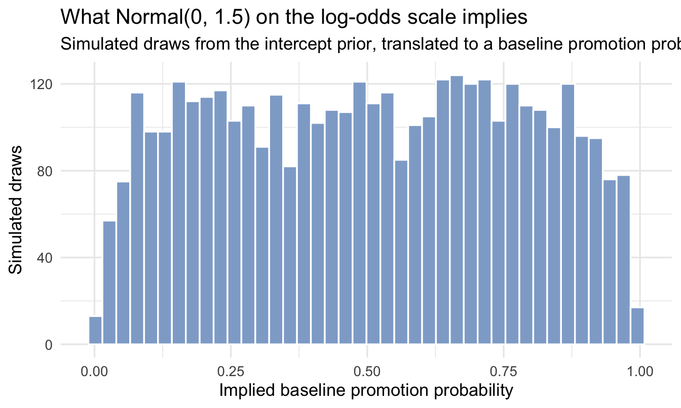
A prior on the log-odds scale is hard to judge by eye — `1.5`
doesn't mean much until you translate it. So this is the chapter where a
**prior predictive check** earns its keep, exactly as Chapter 5
described: simulate draws from the intercept prior and translate them to a
probability:
```{r plot-prior-logit}
set.seed(901)
tibble(logit_intercept = rnorm(4000, mean = 0, sd = 1.5)) |>
mutate(prob = plogis(logit_intercept)) |> # <1>
ggplot(aes(prob)) +
geom_histogram(bins = 40, fill = "#8fabd0", colour = "white") +
labs(title = "What Normal(0, 1.5) on the log-odds scale implies",
subtitle = "Simulated draws from the intercept prior, translated to a baseline promotion probability",
x = "Implied baseline promotion probability", y = "Simulated draws")
```
1. `plogis()` is the inverse logit — it converts log-odds back to a
probability, undoing the two-step transformation above. Its
partner `qlogis()` goes the other way. You will use `plogis()`
constantly from here on.
::: callout-note
Spread fairly evenly across plausible promotion rates, with a little
extra weight near the extremes — reasonable for "we don't know the
baseline rate yet," and nowhere near committing to, say, "everyone
gets promoted."
:::
------------------------------------------------------------------------
## Fit the model
```{r fit-logit}
priors <- c(
prior(normal(0, 1.5), class = Intercept),
prior(normal(0, 1), class = b) # <1>
)
fit_logit <- brm(
promoted ~ customer_rate_s + performance_f,
data = salespeople, family = bernoulli(),
prior = priors,
chains = 4, iter = 2000, seed = 9, refresh = 0
)
summary(fit_logit)
```
1. No `sigma` this time. A Bernoulli outcome has no separate spread
parameter to estimate — once you know the probability, the
variability is fully determined. One fewer thing to think about.
::: callout-tip
## Why standardised, not just centred?
Chapter 6 centred `customer_rate`. Here we **standardised** it instead —
that is the `scale()` call in the setup chunk at the top of the chapter,
which centres the variable *and* divides by its standard deviation, so
one unit is now one SD rather than one rating point.
The reason is the prior. On the log-odds scale, `normal(0, 1)` is a
sensible weakly-informative prior for a coefficient — it says a
one-unit change is unlikely to swing the odds by more than a factor of
about seven. But "one unit" only means something once you've fixed the
scale of the predictor. Standardising makes that prior mean the same
thing regardless of whether the variable is measured in points,
pounds or years.
The cost is that your coefficients are now "per standard deviation",
which is not a unit anyone thinks in — so we translate back before
showing anyone.
:::
------------------------------------------------------------------------
## Interpreting the results
### Translation 1 — odds ratios
Exponentiating a log-odds coefficient turns it into an **odds ratio**:
the factor by which the odds multiply.
```{r odds-ratios}
fixef(fit_logit) |>
as_tibble(rownames = "term") |>
mutate(odds_ratio = exp(Estimate)) |> # <1>
select(term, Estimate, odds_ratio)
```
1. `exp()` undoes the logarithm, taking us from log-odds back to
odds. An odds ratio above 1 means more likely to be promoted;
below 1, less likely; exactly 1, no effect.
::: callout-important
## The mistake almost everyone makes with odds ratios
An odds ratio of 3 does **not** mean "three times as likely".
It means the *odds* triple, and odds are not probabilities. Work it
through at a 30% baseline promotion rate:
- Odds of 0.3 / 0.7 = **0.43**
- Triple them: **1.29**
- Convert back: 1.29 / (1 + 1.29) = **56%**
So an odds ratio of 3 took the probability from 30% to 56% — not quite
**double**, nowhere near triple. Report it as "three times as likely"
and you have overstated your finding by a factor of about 1.6.
The gap depends entirely on the baseline. When an outcome is **rare**
— a 2% chance of something — odds and probabilities are close, and an
odds ratio of 3 really does mean roughly three times as likely. When
the outcome is **common**, which is nearly everything in People
Analytics, the two diverge badly.
This matters beyond pedantry. Odds ratios turn up constantly in pay
equity, promotion equity and adverse impact analysis — exactly the
places where overstating an effect by 60% is least acceptable. If you
are going to quote one to a non-technical audience, **convert it to
probabilities first**, which is the next section.
:::
### Translation 2 — predicted probabilities
Odds ratios are exact but abstract. **Probabilities** are what a
manager can act on.
```{r predicted-prob}
rate_mean <- mean(salespeople$customer_rate)
rate_sd <- sd(salespeople$customer_rate)
tier_colours <- c("#9db4d4", "#5a83b8", "#2f5389", "#122a52")
promo_grid <- expand_grid(
customer_rate_s = seq(-2, 2, by = 0.1),
performance_f = levels(salespeople$performance_f)
) |>
mutate(customer_rate = customer_rate_s * rate_sd + rate_mean) # <1>
promo_grid |>
add_epred_draws(fit_logit) |>
mean_qi(.epred, .width = 0.95) |>
ggplot(aes(customer_rate, .epred,
colour = performance_f, fill = performance_f)) +
geom_ribbon(aes(ymin = .lower, ymax = .upper), alpha = 0.15, colour = NA) +
geom_line(linewidth = 1) +
scale_colour_manual(values = tier_colours) + # <2>
scale_fill_manual(values = tier_colours) +
scale_y_continuous(labels = scales::percent) +
labs(title = "Predicted promotion probability",
subtitle = "Rises with customer rating, and sharply with performance tier",
x = "Customer rating", y = "P(promoted)",
colour = "Performance tier", fill = "Performance tier")
```
1. Undoing the standardisation for the axis. The model was fitted on
standardised units because that made the priors sensible — but
"customer rating of 4.2" is a thing your audience recognises and
"0.7 standard deviations" is not. **Fit on whatever scale suits
the model; present on the scale the business thinks in.**
2. A sequential ramp: light for tier 1, darkest for tier 4. Performance
tier is **ordered**, so the colours should be ordered too — a reader
can then rank the lines without consulting the legend. The four
shades are spaced far enough apart in lightness to stay separable
when printed or projected.
::: callout-important
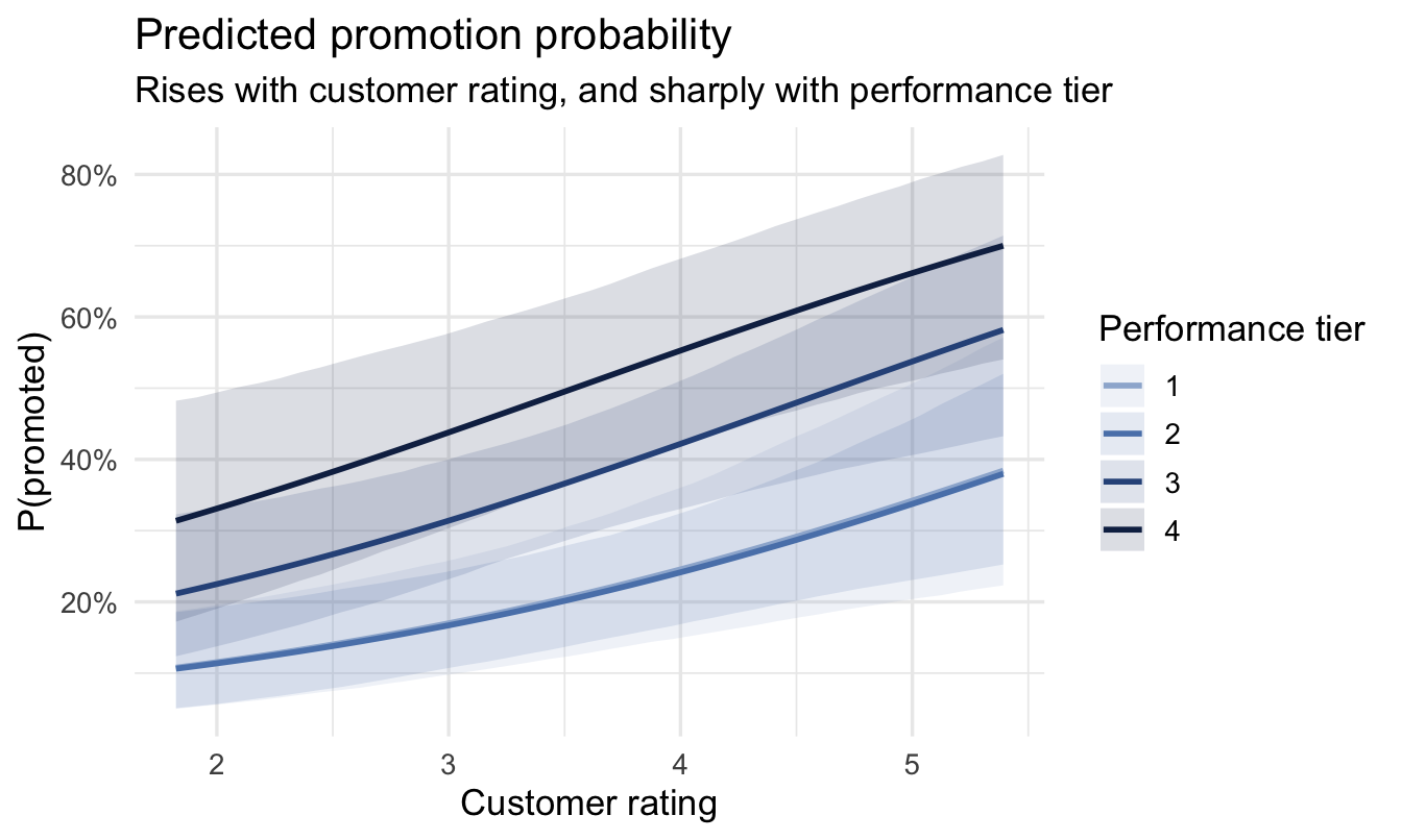
## This chart is the deliverable
Everything else in this chapter is scaffolding. This is what goes on
the slide.
Promotion likelihood **climbs with customer rating** and is
**dramatically higher for top performers** — with honest uncertainty
bands around both, on a scale anyone in a meeting can read. A talent team
could act on it tomorrow: check whether the promotion process is
weighting these factors the way leadership intends.
Note what isn't on it. No coefficients, no log-odds, no odds ratios,
no p-values, no mention of `brms`. The rigour is in how the number was
produced, not in how much of the machinery you show.
:::
To say that out loud you need the two numbers themselves, not the
chart. Pull them straight off the same posterior:
```{r headline-numbers}
tiers <- levels(salespeople$performance_f)
headline <- tibble(
customer_rate_s = 0, # <1>
performance_f = factor(c(last(tiers), tiers[2]), # <2>
levels = tiers)
) |>
add_epred_draws(fit_logit) |>
mean_qi(.epred, .width = 0.95)
p_top <- headline |> filter(performance_f == last(tiers)) |> pull(.epred)
p_mid <- headline |> filter(performance_f == tiers[2]) |> pull(.epred)
headline
```
1. Standardised units, so zero **is** the average customer rating —
the same centring habit from Chapter 6, doing the same job.
2. The top tier and a mid tier, holding customer rating fixed so the
comparison isolates performance.
::: callout-tip
## The sentence to go with it
*"A top-rated salesperson with average customer scores has about a
`r round(100 * p_top)`% chance of promotion. A mid-tier one with the
same customer scores has about `r round(100 * p_mid)`%. We're
confident in that gap — and customer rating matters too, but much less
than the performance tier does."*
One chart, one sentence, no jargon, and a number attached to every
claim. That's the deliverable.
:::
### Does it fit?
```{r ppc}
pp_check(fit_logit, type = "bars", ndraws = 100) + # <1>
scale_x_continuous(breaks = c(0, 1),
labels = c("Not promoted", "Promoted")) +
labs(title = "Posterior predictive check (binary outcome)",
subtitle = "Bars = what the model predicts; points = what actually happened",
x = NULL, y = "Number of salespeople")
```
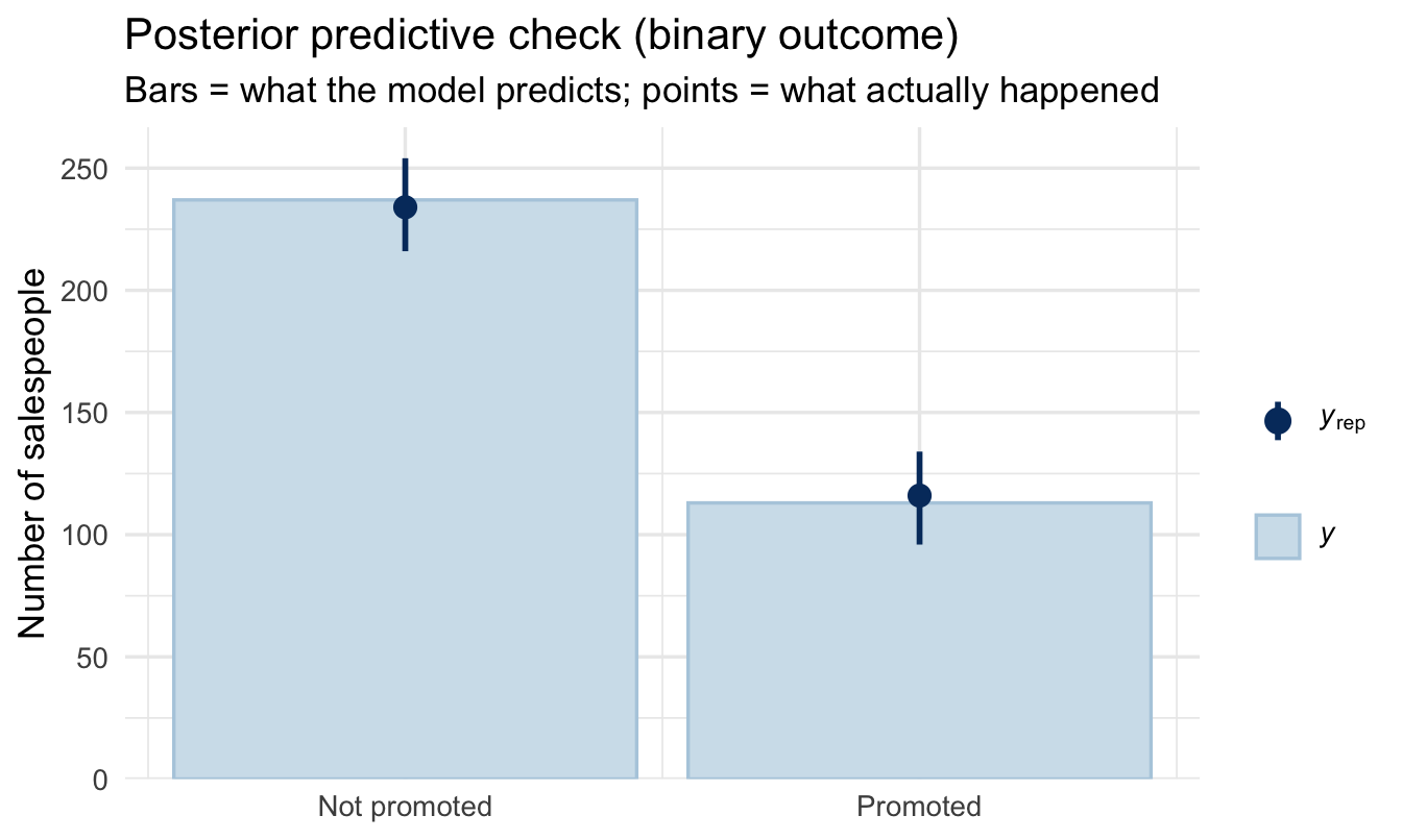
1. `type = "bars"` instead of the default density overlay. With a 0/1
outcome there are only two possible values, so a smooth density
curve would be meaningless — we want the observed *count* of 0s
and 1s compared against the counts the model predicts. Match the
check to the shape of the outcome.
You want the observed points to sit inside the predicted intervals for
both bars. If the model systematically predicts too many promotions,
you'll see it here and nowhere else.
### Your turn {.unnumbered}
**1.** Add `sales` to the logistic model. Does higher sales change
promotion odds, holding customer rating and performance tier constant?
Report its odds ratio — and then convert it into a change in
probability at a 30% baseline, which is the version you'd actually
present.
**2.** Compare the model with and without `sales` using LOO from
Chapter 7. Does it earn its place?
```{r your-turn}
# Your code here
```
------------------------------------------------------------------------
## On the job {.unnumbered}
::: callout-important
## Why this matters day to day
Yes/no outcomes are most of what People Analytics is asked about —
accept or decline, pass or fail probation, promoted or not, stayed or
left. Logistic regression is the workhorse for all of them, and it's
the same `brm()` call you already know with `family = bernoulli()`.
The part that separates a good analyst here is **translation**. The
model speaks log-odds, the software offers you odds ratios, and your
stakeholder needs probabilities. Doing that conversion carefully — and
resisting the temptation to say "three times as likely" when the odds
ratio is 3 — is what keeps your findings both useful and honest.
:::
------------------------------------------------------------------------
## Summary {.unnumbered}
::: callout-note
## Today you learned
1. A straight line can't model a probability, because lines don't
stop at 0 and 1. **Log-odds** are unbounded, so we fit the line
there and translate back.
2. **Logistic regression** (`family = bernoulli()`) does exactly
that, and has no `sigma` to estimate.
3. **Log-odds of 0 is a 50/50 chance**, and the scale is symmetric
around it.
4. An **odds ratio** is not a ratio of probabilities. An OR of 3 at a
30% baseline is a move to 56% — not "three times as likely".
Convert to probabilities before presenting.
5. **Fit on whatever scale suits the model; present on the scale the
business thinks in.**
6. Match your **posterior predictive check** to the shape of the
outcome — `type = "bars"` for binary.
:::
## Next chapter {.unnumbered}
**The complete workflow** — you now have every technique in Part III.
Next we assemble them into a single repeatable recipe, and a map of
which model to reach for whatever your outcome looks like.