# Groups & Categories: Comparing and Choosing Models
## Welcome back {.unnumbered}
Last chapter we explained sales with a *number* — customer rating.
Real questions usually involve **categories** too: one performance
tier against another, one region against another, one hiring source
against the rest.
### The question that gets asked in every organisation {.unnumbered}
Your HR Director has a problem, and it isn't a statistical one yet.
> *"Managers rate everyone 1 to 4 every year. We pay bonuses off those
> ratings and we use them for promotion decisions. Someone on the exec
> asked me last week whether the ratings actually mean anything, and I
> didn't have an answer."*
That's a serious question. If the ratings don't track anything real,
the organisation is distributing money and careers on the strength of
a number that doesn't measure what it claims to.
Turn it into something answerable, the same way you did in Chapter 4.
"Do ratings mean anything?" becomes:
> **Do salespeople in higher performance tiers actually sell more —
> and by how much?**
And the moment you write that down, a rival explanation appears. Top
performers might sell more simply because they happen to have happier
customers, which we already know predicts sales. If that's all this
is, the rating is adding nothing that a customer-satisfaction score
wouldn't tell you more cheaply.
::: callout-note
Notice the two-part shape. There's an effect to estimate, and there's
a competing story to rule out. Almost every group comparison you'll
run in People Analytics has that shape — *Do internal hires perform
better, or are they just more senior? Does the training work, or did
the keen people self-select into it?* — and this chapter is how you
handle both halves.
:::
## What you'll be able to do by the end {.unnumbered}
1. Include a **categorical predictor** in a `brms` model, and
understand what R does to it behind the scenes
2. Read a coefficient as a **difference from a reference group** —
the single most misread output in regression
3. Estimate each group's average directly, and take a **contrast**
between any two with a credible interval
4. Combine categorical and continuous predictors, and say precisely
what "holding the other constant" does and doesn't mean
5. Compare models with **LOO cross-validation** instead of picking
the one that fits best
------------------------------------------------------------------------
## Setup
```{r setup}
library(tidyverse)
library(peopleanalyticsdata)
library(brms)
library(tidybayes)
library(ggdist)
library(loo)
theme_set(theme_minimal(base_size = 13))
set.seed(2026)
data("salespeople", package = "peopleanalyticsdata")
# Chapter 1 found a single missing value in each of `sales`,
# `customer_rate` and `performance`; dropping those rows here keeps
# the rest of this chapter's code simple.
salespeople <- salespeople |>
drop_na(sales, customer_rate, performance, promoted) |>
mutate(performance_f = factor(performance)) # <1>
# Centred as in Chapter 6, so the intercept stays interpretable
# once we add a continuous predictor alongside the categories.
mean_rate <- mean(salespeople$customer_rate)
salespeople <- salespeople |>
mutate(customer_rate_c = customer_rate - mean_rate)
priors <- c(
prior(normal(400, 200), class = Intercept),
prior(normal(0, 200), class = b), # <2>
prior(exponential(0.005), class = sigma)
)
```
1. `performance` is stored as an integer, and left that way `brms`
would treat it as a *number* — assuming the gap from tier 1 to 2
is the same size as 3 to 4, and that "2.5" is meaningful.
`factor()` says: these are four **labels**, and I'm not claiming
the spacing between them means anything. Chapter 18 is entirely
about when that assumption is and isn't safe.
2. One prior set, defined once and reused for every model in this
chapter — the same object-then-`prior = priors` pattern as
Chapters 5 and 6.
**Two of these three you have already seen drawn.** The habit of looking
at a prior before fitting still stands; it just doesn't need repeating
when the prior hasn't changed:
- `normal(400, 200)` on the **Intercept** — plotted in Chapter 5
("Our prior for average sales"). Unchanged here, because the
intercept still means the same thing: average sales for the
reference group.
- `exponential(0.005)` on **sigma** — plotted in Chapter 5 ("Our prior
for the spread between salespeople"). Also unchanged.
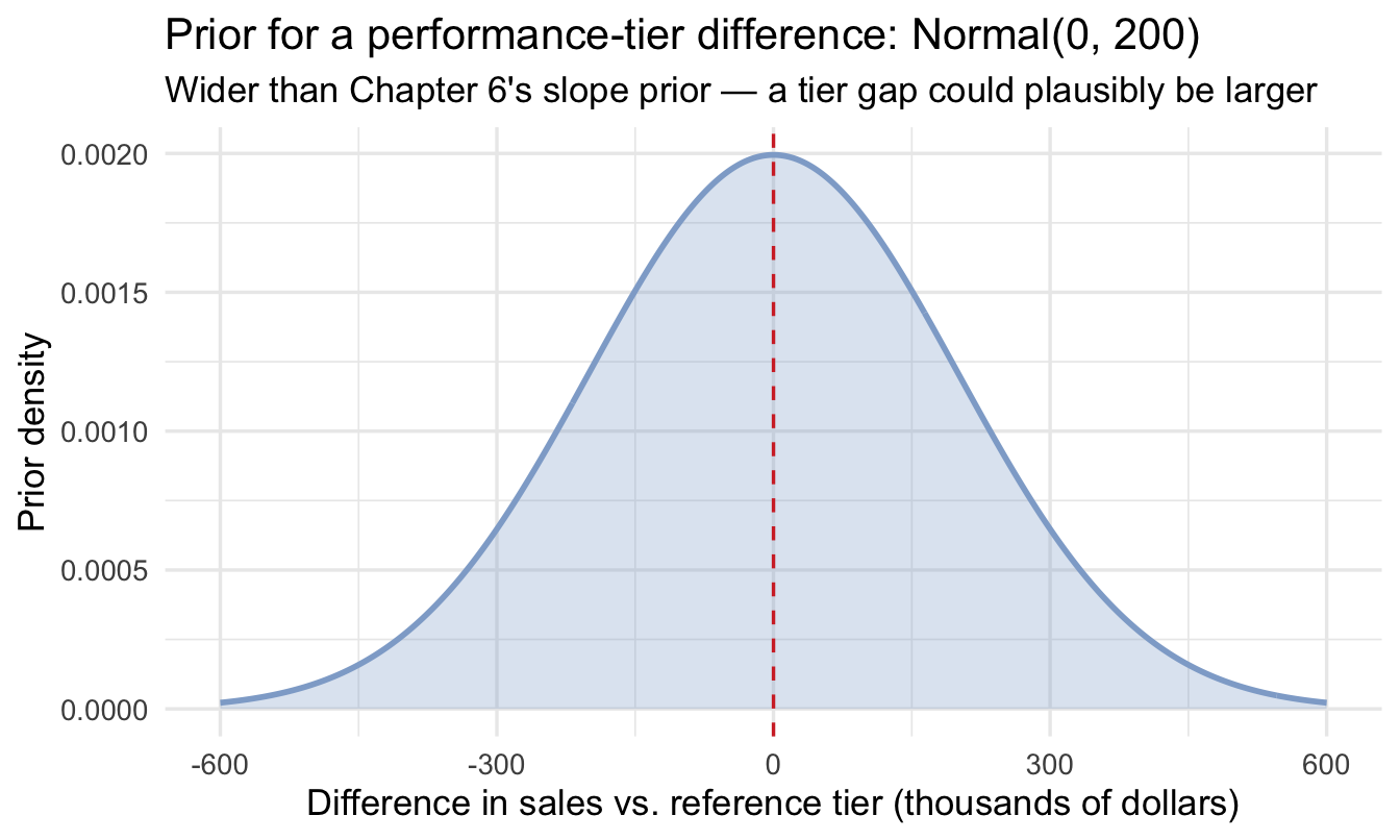
- `normal(0, 200)` on **b** — this one *is* new. Chapter 6's slope
prior was `normal(0, 100)`, and a jump between performance tiers
could plausibly be larger than a one-point change in a continuous
rating. So it gets widened, and it gets drawn, in the section below.
The rule this follows, and one worth adopting in your own work: **plot a
prior the first time you use it, and whenever you change it.** Redrawing
an unchanged prior in every chapter would train readers to skip the
plots, which is the opposite of the habit being built.
------------------------------------------------------------------------
## Categorical predictors
### How a model handles a category
Regression multiplies things. It cannot multiply by "performance
rating 3", because that isn't a quantity — it's a name.
So R does something mechanical. It picks one level as the
**reference**, then creates a yes/no column for each of the others:
| Salesperson | tier | `performance_f2` | `performance_f3` | `performance_f4` |
|--------------|--------|--------------|--------------|--------------|
| A | 1 | 0 | 0 | 0 |
| B | 2 | 1 | 0 | 0 |
| C | 3 | 0 | 1 | 0 |
| D | 4 | 0 | 0 | 1 |
Those yes/no columns have different names in different fields. In
economics and econometrics, where I trained, they are called **dummy
variables**. You will also see them called *indicator variables*. They
are the same thing.
Notice there's no column for tier 1. There doesn't need to be — a
salesperson with zeros everywhere *is* tier 1. Adding a fourth column
would be redundant information, and the model would have no way to
choose between two equally good answers.
That absent column is the reference group, and it changes what every
other number means.
::: callout-note
Two asides about these columns.
**You do not need to build them yourself.** It took me years to notice
that R does this on its own. I had been taught to create dummy variables
by hand, so I carried on creating them by hand — adding the columns to my
data, and remembering to leave one out. If you have the same habit from
another language or another course, you can drop it. Give R a factor and
it builds the columns for you. More usefully, it also keeps track of
which level is the reference, which is the part that is easiest to lose
when you do the work yourself.
**Machine learning does it slightly differently.** There the same idea is
called **one-hot encoding**, and it normally keeps a column for *every*
level, including the reference. That works for a regularised model, which
can handle the redundancy. It would break the regression here, for the
reason in the paragraph above.
:::
::: callout-important
With `performance_f` (1/2/3/4), R takes the lowest level, 1, as the
reference. The model then reports **how much more or less** each other
tier sells *than tier 1* — never each tier's own average.
:::
### A prior for a tier gap
The intercept and sigma priors are the ones from Chapter 6, but `b`
now means something new. It isn't a one-point change in a continuous
rating; it's the **gap between two performance tiers**, which could
plausibly be a much bigger jump. We widen it accordingly — and, as
always, look at it before fitting anything:
```{r plot-prior-b}
tibble(b = seq(-600, 600, length.out = 400)) |>
  mutate(density = dnorm(b, mean = 0, sd = 200)) |>
  ggplot(aes(b, density)) +
  geom_area(fill = "#8fabd0", alpha = 0.30) +
  geom_line(colour = "#8fabd0", linewidth = 1) +
  geom_vline(xintercept = 0, colour = "#d32f2f", linetype = "dashed") +
  labs(title = "Prior for a performance-tier difference: Normal(0, 200)",
       subtitle = "Wider than Chapter 6's slope prior — a tier gap could plausibly be larger",
       x = "Difference in sales vs. reference tier (thousands of dollars)",
       y = "Prior density")
```
```{r fit-performance}
fit_perf <- brm(
  sales ~ performance_f, data = salespeople, family = gaussian(),
  prior = priors,
  chains = 4, iter = 2000, seed = 7, refresh = 0
)

summary(fit_perf)
```
### Prior predictive check: skipped on purpose
Chapter 5 ran a full prior predictive check — simulating whole datasets
from the priors alone to see whether they implied believable sales
figures. We are not repeating it here, and it is worth saying why rather
than letting it look like an oversight.
Two of these three priors are unchanged from Chapter 5, and were checked
there. The third, the tier gap, is wider than Chapter 6's slope prior but
on the same scale and centred on the same place, so the simulated
datasets would look near-identical to the ones you have already seen.
The habit to take away is not "always run one". It is **run one whenever
the priors move onto a scale you have not checked before** — which is why
Chapter 9 runs a fresh one the moment we switch to the log-odds scale,
where your intuition genuinely does not transfer.
### Reading those rows
- The **Intercept** is average sales for the reference group —
performance rating 1, and *only* rating 1.
- Each `performance_fN` row is **how much more that tier sells than
tier 1**. To get tier 3's average you'd add its coefficient to the
intercept.
::: callout-important
## The mistake everyone makes once
Every non-reference row is a **difference**, not a level.
Read `performance_f3 = 210` as "tier 3 sells about 210 more than tier
1", never as "tier 3 sells 210". The second reading turns a strong
finding into a nonsensical one, and because the numbers look plausible
either way, nobody in the meeting notices.
Two further consequences worth knowing:
- **The coefficients are all relative to a choice you didn't
consciously make.** R picked tier 1 because it sorts first. Change
the reference to tier 4 and every number in that table changes —
yet it's the identical model, making identical predictions. The
coefficients are a *description* of the fit, not the fit itself.
- **The comparisons you get are not the ones you may want.** This
output tells you tier 2 vs 1, 3 vs 1 and 4 vs 1. It does not tell
you 4 vs 3, which is very likely the comparison your HR Director
cares about — the top of the scale against the tier just below it.
Both problems have the same fix, and it's the next section.
:::
------------------------------------------------------------------------
## Estimating group averages directly
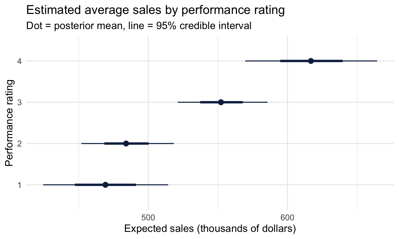
Reading differences-from-reference gets awkward once you have several
levels. Easier: estimate each group's **expected value directly**,
then compare whichever pairs you care about.
```{r group-means}
perf_epred <- salespeople |>
distinct(performance_f) |> # <1>
add_epred_draws(fit_perf) # <2>
perf_epred |>
ggplot(aes(x = .epred, y = fct_reorder(performance_f, .epred))) +
stat_pointinterval(colour = "#122a52") + # <3>
labs(title = "Estimated average sales by performance rating",
subtitle = "Dot = posterior mean, line = 95% credible interval",
x = "Expected sales (thousands of dollars)", y = "Performance rating")
```
1. A four-row grid: one for each tier. This is the same
"make a grid, push it through the model" pattern as Chapter 6's
prediction bands, just with categories instead of a sequence.
2. For every tier, and every posterior draw, what does the model
expect? Note we get the **averages themselves** here, not
differences from a reference — `add_epred_draws()` has already
done the addition for us.
3. `stat_pointinterval()` is `stat_halfeye()` with the density
removed — useful when you're showing several groups at once and
the full shapes would collide.
That's a chart you can put in front of the exec committee. Four tiers,
four estimates, four honest intervals, no reference group to explain.
### A specific contrast
Now the comparison the coefficient table wouldn't give us — the top
tier against the bottom:
```{r contrast}
perf_epred |>
compare_levels(.epred, by = performance_f, # <1>
comparison = list(c("4", "1"))) |>
mean_qi(.epred, .width = 0.95)
```
1. `compare_levels()` subtracts one group's draws from another's,
**draw by draw** — the Chapter 5 technique, with the bookkeeping
done for you. It isn't subtracting two summary numbers and hoping;
it produces a full posterior *for the difference*, which correctly
accounts for the uncertainty in both groups at once. Swap in
`c("4", "3")` for the top-two comparison.
If that interval sits clearly away from zero, the two tiers credibly
differ in sales — and, more usefully, the interval tells your HR
Director *how much* the rating is worth.
Because the difference is a posterior like any other, you can also ask
for the probability directly:
```{r contrast-probability}
perf_epred |>
  compare_levels(.epred, by = performance_f,
                 comparison = list(c("4", "1"))) |>
  ungroup() |>
  summarise(p_tier4_higher = mean(.epred > 0))
```
Report that number *after* the interval, never instead of it. The
interval says how big the gap is; the probability only says which side
of zero the posterior mostly sits on.
::: callout-note
There is one difference from Chapter 5 worth noticing. There we fitted
two separate models, so the draws were independent. Here both tier
estimates come out of the **same** model, which means their draws are
correlated — and pairing them row by row is exactly what carries that
correlation into the difference. `compare_levels()` does this
correctly. Summarising each tier first and subtracting the summaries
would not.
:::
::: callout-tip
This is why estimating the group means directly is worth the extra
step. Once you have `perf_epred`, **any** comparison is available —
4 vs 3, 3 vs 2, top two against bottom two — without refitting
anything. It's the Chapter 5 point again: with the posterior in hand,
you own every question you might want to ask of it.
:::
::: callout-note
## A different lens: this is the Bayesian version of ANOVA / a t-test
Comparing group means with a categorical predictor here is doing
exactly the same job as a classical **one-way ANOVA** (more than two
groups) or a **t-test** (two groups) — just reported as a full
posterior for each group and each contrast, rather than an F-statistic
or a t-statistic and a p-value. Where a p-value tells you *"could this
difference be zero?"*, the credible interval above tells you *"how
big is the difference, and how sure are we"* — usually the more useful
answer for a business audience.
:::
::: callout-note
## A brief word on Bayes Factors here too
A classically trained reader might reach for a **Bayes Factor** at
this exact point — "is there a real difference between these two
performance tiers, yes or no?" Chapter 5 covers why this book leans on
the contrast-plus-credible-interval approach above instead: it answers
"how big" directly, in the same units as the decision, rather than a
single evidence ratio for "different vs. not."
:::
------------------------------------------------------------------------
## Combining continuous and categorical
Now the rival explanation. Nothing stops us using both predictors at
once — and if the tier differences survive once customer rating is in
the model, the rating system is telling us something the satisfaction
score doesn't.
```{r combined}
# Same priors as above — nothing new to visualise.
fit_combined <- brm(
sales ~ customer_rate_c + performance_f, data = salespeople, # <1>
family = gaussian(),
prior = priors,
chains = 4, iter = 2000, seed = 72, refresh = 0
)
fixef(fit_combined) # <2>
```
1. The **centred** rating, following Chapter 6. It matters more here
than it did there: with a raw rating, the intercept would be
"expected sales for a tier-1 salesperson with a customer rating of
zero" — a doubly impossible person. Centred, it reads as "a tier-1
salesperson with an average customer rating", which at least
exists.
2. `fixef()` is a compact alternative to `summary()` when you only
want the coefficient table and not the sampler diagnostics. Check
the diagnostics anyway.
### "Holding the other constant"
Each coefficient is now read **with the other held fixed**:
- the customer-rating slope is the sales change per point **within a
performance tier**
- the performance-tier differences are the gaps **between
salespeople with the same customer rating**
Compare the tier coefficients here against `fit_perf`. If they've
barely moved, the rating system is carrying information of its own. If
they've collapsed towards zero, then "top performers sell more" was
substantially a story about customer satisfaction all along — and your
answer to the exec changes completely.
::: callout-important
## What that phrase actually means — and a trap inside it
"Holding customer rating constant" does **not** mean you intervened
and set everyone's rating to the same value. Nothing was held
anywhere. It means: *among salespeople who happen to have the same
customer rating, here is the tier difference.* It's a comparison
within the data you have, not an experiment.
That distinction becomes urgent when you decide what to control for,
because **adding a variable is not automatically the more rigorous
choice**. If customer rating is partly *caused by* being a good
salesperson, then controlling for it strips out some of the very
effect you were trying to measure, and the tier gap shrinks for a
reason that has nothing to do with the truth.
The clearest example in People Analytics is pay. Analyse a gender pay
gap controlling for job grade, and you get "the gap within grade" —
which is a real and useful number. But if part of how the gap
operates is that women are promoted more slowly into higher grades,
you've just controlled away the mechanism and reported a smaller gap
than exists.
Neither analysis is wrong. They answer different questions, and you
have to know which one you were asked. **Deciding what to control for
is a judgement about how the world works, not a statistical
choice** — and Chapter 10 walks through making it deliberately.
:::
------------------------------------------------------------------------
## Is the bigger model worth it?
### The trap
The obvious way to choose between two models is to see which fits the
data better. It's also wrong, and it's worth watching it fail rather
than taking my word for it.
Here we add a column of **pure random noise** — a variable we know for
certain has nothing to do with sales, because we just invented it —
and check whether the model fits better:
```{r overfitting-demo}
set.seed(701)
salespeople_noise <- salespeople |>
mutate(pure_noise = rnorm(n(), mean = 0, sd = 1)) # <1>
tibble(
model = c("customer rating only", "customer rating + random noise"),
r_squared = c(
summary(lm(sales ~ customer_rate_c, data = salespeople_noise))$r.squared,
summary(lm(sales ~ customer_rate_c + pure_noise, data = salespeople_noise))$r.squared
)
)
```
1. Meaningless numbers, unrelated to anything. If model fit were an
honest guide, adding this column would leave the fit unchanged.
It doesn't. The fit **improves** — a little, but it always improves,
and it can never get worse. Give the model a free parameter and it
will find some accidental pattern in the noise to exploit.
::: callout-important
So "it fits better" is **not** evidence that a model is better. With
enough junk variables you can fit any dataset perfectly and predict
nothing whatsoever. This is **overfitting**, and it's the reason model
choice needs a fairer test than looking at the data you already have.
:::
### The real question
A good model should predict observations it has **never seen**. **LOO
cross-validation** (Leave One Out cross-validation) estimates exactly that: leave out one observation,
predict it from the rest, repeat for every observation. Because the
left-out point took no part in the fit, there's no way to cheat.
```{r loo}
# Same customer_rate-on-sales model as Chapter 6 — priors already
# visualised there, refit here purely for the LOO comparison.
fit_simple <- brm(
  sales ~ customer_rate_c, data = salespeople, family = gaussian(),
  prior = priors,
  chains = 4, iter = 2000, seed = 73, refresh = 0
)

loo_compare(loo(fit_simple), loo(fit_combined))
```
### Reading the output
- The model on the **top row** is the best predictor, and is always
shown with `elpd_diff` of 0 — everything is measured relative to
it.
- **`elpd_diff`** — how far behind each other model is. Negative
means worse. The units are log predictive density, which nobody
interprets directly; only the comparison matters.
- **`se_diff`** — the uncertainty in that gap, which is the column
people skip and shouldn't.
### What LOO does not tell you
One boundary is worth drawing now, because it is easy to over-read this
tool. LOO answers exactly one question: **which of these models predicts
new data better?**
That is not the same question as *which model should I read a
coefficient from*. A model can win on LOO and still be the wrong model
to interpret — adding a variable often improves prediction while making
the coefficient you care about mean something different, or nothing at
all. Which variables belong in a model, when the goal is to explain
rather than to predict, is a question about cause and effect that no fit
statistic can answer. Chapter 21 is about how to answer it.
For today, the practical version: use LOO to choose between models that
are candidates for the *same* job, and don't let it pick your variables
for you.
There is also a question this chapter has quietly assumed away. Both
models here let performance tier shift sales up or down by a fixed
amount, the same at every customer rating. If the two predictors
*interact* — if rating matters more for top performers than for
low ones — neither model can say so. Chapter 13 covers how to ask, and
the trap that comes with the answer.
::: callout-important
## Don't just read the top row
`elpd_diff` on its own tells you which model won. `se_diff` tells you
whether the win means anything.
A rough working rule: treat a difference as meaningful when
`elpd_diff` is at least **two to four times** its `se_diff`. If the
gap is smaller than its own standard error, the two models predict
about equally well, and LOO has told you something genuinely useful —
**pick the simpler one**. It'll be easier to explain, and it's less
likely to be fitting noise.
Resist the urge to declare a winner from a difference of 1.2 with a
standard error of 3. That's the same overconfidence the whole chapter
is warning about, just described in more technical language.
:::
::: callout-tip
## For the ML/DS crowd
**LOO cross-validation** is the Bayesian sibling of the **k-fold
cross-validation** you already use to evaluate ML models — same
motivation (don't trust a model's fit to data it's already seen),
different mechanics (LOO uses each posterior's full predictive
distribution rather than refitting the model from scratch on each
fold, which is normally far cheaper for a Bayesian model than
literally refitting it thousands of times).
:::
### Does it fit?
The model comparison told us which of the two candidates predicts better.
It did not tell us whether either of them reproduces the data at all —
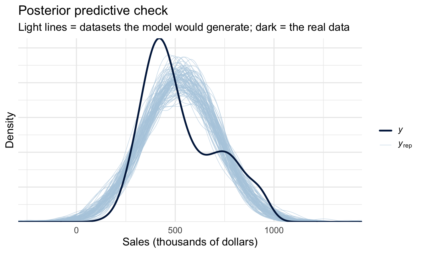
LOO is relative, and two poor models can still be ranked. Step 8 of the
workflow is the absolute check:
```{r ppc-groups}
pp_check(fit_combined, ndraws = 100) +
  labs(title = "Posterior predictive check",
       subtitle = "Light lines = datasets the model would generate; dark = the real data",
       x = "Sales (thousands of dollars)", y = "Density")
```
You want the dark line to sit inside the spread of the light ones. A
systematic gap — the model consistently missing the peak, or unable to
generate the long right tail of high sellers — matters more than any
`elpd_diff`, because it says the model cannot produce data that looks
like yours no matter which version you pick.
### Your turn {.unnumbered}
**1. An interaction.** Fit
`sales ~ customer_rate_c * performance_f` — the `*` allows the
customer-rating slope to *differ by tier*, rather than forcing one
common slope. Compare it to `fit_combined` with LOO. Does letting the
slopes vary earn its keep, or is it the random-noise column in
disguise?
**2. A different reference.** Refit `fit_perf` with tier 4 as the
reference level (`fct_relevel(performance_f, "4")`). Confirm for
yourself that every coefficient changes and not one prediction does.
```{r your-turn}
# Your code here
```
------------------------------------------------------------------------
## On the job {.unnumbered}
::: callout-important
## Why this matters day to day
Most People Analytics questions are group comparisons with other
factors to control for. Reporting the **size** of a difference with a
credible interval — and justifying your model choice with **LOO**
rather than "I added everything I had" — is exactly the rigour a
sceptical stakeholder should expect, and far more informative than a
table of p-values.
:::
------------------------------------------------------------------------
## Summary {.unnumbered}
::: callout-note
## Today you learned
1. R turns a category into **yes/no columns**, dropping one level as
the **reference**.
2. A categorical coefficient is therefore a **difference from the
reference group**, never that group's own average. Change the
reference and every coefficient changes while the model stays
identical.
3. `add_epred_draws()` on a grid of levels gives each group's
expected outcome directly; `compare_levels()` subtracts draw by
draw for any **contrast** you want, without refitting.
4. Continuous and categorical predictors combine, and each is read
**among observations with the same value of the others** — a
comparison, not an intervention. **Choosing what to control for is
a judgement about causation**, and controlling for a consequence
of your predictor will hide the very effect you're after.
5. **Adding any variable improves fit**, including pure noise. Fit is
not evidence.
6. **LOO** compares models by predictive accuracy on unseen data —
the honest way to choose, and the Bayesian cousin of
cross-validation. Read `se_diff` alongside `elpd_diff`, and when
they're comparable, **take the simpler model**.
7. This is another point where estimation (credible intervals on a
contrast) does the job a Bayes Factor or classical significance
test would otherwise be reached for.
:::
## Next chapter {.unnumbered}
**When data has structure** — salespeople and managers nested within
offices, and why ignoring that grouping makes you overconfident.